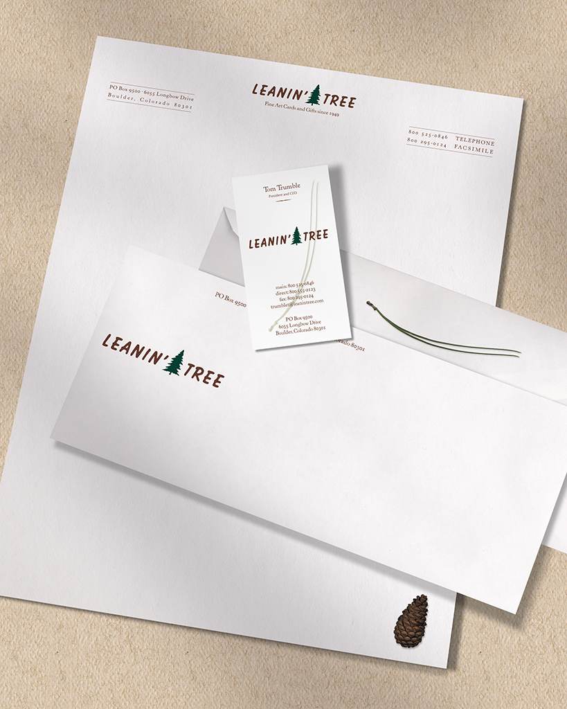
Many projects were created for Leanin’ Tree over the years, including greeting card lines and other product, catalogs, direct mail campaigns. One of our favorite projects was this identity system, developed to update a corporate image that had been used since the early 1960’s.
The elegant treatment and old-style typeface pays homage to the longevity of the company. The clean, simple design is inexpensive to produce, and will not quickly become outdated.
The pine cone and pine needles are used as both graphic and conceptual elements. Each recipient of correspondence would receive “a small piece of the Leanin’ Tree.” The pine needles are also formed in the shape of a smile, symbolizing the joy the company takes in producing their products, and the smiles Leanin’ Tree’s products bring to the both the sender and receiver.